I’ve learned that designing apps for Learning Means Caring About Fonts

I didn’t set out to care about fonts. I really didn’t. But somewhere along the road of building a spelling app for my son, I remembered something important from my classroom teaching days: some fonts help, and some fonts hurt - especially when you’re trying to help a kid read.
During my teacher training days, Comic Sans was all the craze in classrooms because it appealed to kids. But it quickly became one of the most hated and ridiculed fonts. I didn’t fully understand the backlash at first, but after a bit of research, I saw why: it was overused, popping up everywhere from corporate memos to CVs. It was inconsistently designed, and over time, it just became synonymous with being childish and unprofessional.
Ironically, Comic Sans was never designed for readability, but it turns out, it was quite readable for young and beginner readers. Unfortunately, by the time people started to realise that, its reputation was already beyond repair.
What Most Fonts Get Wrong (for Learning)
There are fonts out there that look great, clean, modern, sharp. You’ll see them on agency websites, minimalist landing pages, and design blogs. But try using those same fonts with a 7-year-old learning to spell, and you’ll hit a wall.
Many of the default fonts in popular design tools are too tightly spaced. They use high-contrast strokes or overly geometric shapes that make similar letters blur together. For confident adult readers, it’s barely noticeable. For a child still decoding letterforms? It’s a mess.
What the Good Fonts Do Differently
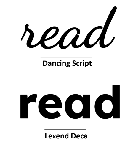
I started testing different fonts with my son, not just for style, but for clarity. That’s when I discovered Lexend, a font family specifically designed to improve reading fluency. It uses wider spacing, open shapes, and balanced proportions to reduce visual stress.
I tested it alongside other fonts, and despite my scepticism, Lexend was picked out by my son immediately. It was no contest. He found it easier to read, and that was all I needed to see.
I also tried Comic Neue, a refined version of Comic Sans (yes, really), which proved more readable than half the fonts I started with. It reminded me that sometimes the “uncool” fonts actually do the job better.
Why It Matters
This stuff isn’t cosmetic. It’s not about being on-brand. It’s about being readable, especially for the kids who need the most help. The ones who already feel behind. The ones for whom a single word can be the difference between confidence and giving up.
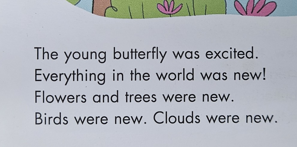
And it really does make a difference. When I was trying to get my son to read World of Reading Star Wars - The Battle of Endor - a story he absolutely loves, it would have been so much easier if it had been written in Lexend instead of whatever serifed font they used. There would have been far fewer tears.


Fonts matter. Letter spacing matters. Line height matters. If you’re building tools for young learners, learners with dyslexia, or just anyone who needs a little more patience from the screen - you need to care!
What I’m Using in SpellMe
Right now, SpellMe.app uses Lexend for the keyboard feature, and I will make sure that it spreads throughout the whole app. It’s clean, it’s accessible, and it makes the words feel calmer. That might sound odd, but once you see it in action, especially compared to more “standard” fonts like Times New Roman, you’ll get it. I also chose it because my son hand picked it as the most readable font when compared to others. To be honest, that was the deciding factor for me.
However, Lexend will not be the only font available. After posing the question on Reddit, it came to light that it would be best to have a choice of fonts. Even though I mentioned that the Serifed font of the Star Wars book my son was struggling to read brought tears to his eyes, it’s not like that for all readers, and not even readers that have learning disabilities. There are some fonts like the EasyReading typeface which is a hybrid font, using both serif and sans serif features.
All of this makes a difference. Let’s take the main picture for this article right at the top. It’s eye-opening.

For some readers, no matter what the word actually is, one font says: this is hard, and the other says: you’ve got this! Can you guess which one is which?
What’s Next
I’m still refining the UI, and fonts will continue to be part of that. Yes, it definitely has to look good. But it really has to work too, for as many beginner spellers and readers as possible. It has to be something that supports children instead of getting in their way.
If you’re building for learners, especially struggling learners, take another look at your fonts. Better yet, try reading your content at age 7, with half the confidence.
It might change everything.
If you’re interested, check out SpellMe.app for yourself. I’d love to hear your opinion.
Edit: Lexend use has now extended to the rest of the main app as well as the landing page, not just the keyboard anymore. Help docs and legals to come.